Challenge
Differentiate Calibria in a market crowded with generic automation promises while keeping the focus on the operating problem consultancy owners actually feel.

Case study · Calibria
Calibria needed a Brand that made its operating advantage clear to consultancy owners. Hark&Verve defined the strategy, name, voice, and visual system around a sharper promise: practical growth without operational chaos. The result is a more recognizable market signal built for real applications.
View the outcome
01
Differentiate Calibria in a market crowded with generic automation promises while keeping the focus on the operating problem consultancy owners actually feel.
Build the Brand around operational clarity: diagnose friction first, connect automation to growth, and express the offer with authority, warmth, and precision.
Brand strategy, naming, verbal identity, visual identity, social media guidelines, and website guidelines.
A coherent Brand system that makes Calibria easier to understand and remember, and gives the team a practical foundation for digital, physical, and everyday operating materials.
The strategic idea
Calibria does not begin with technology. It maps the workflow, finds the friction, and designs the improvement before recommending automation. The Brand needed to make that sequence visible and credible.
Turns operational complexity into stories audiences understand.
Grounds directions in evidence, margin, and measurable impact.
Connects automation to growth before clients see the opportunity.
Identity system
02
The name needed to reflect precision and data-driven decisions, remain easy to spell, and work naturally in English and Spanish.
The verbal identity mirrors consultancy owners trapped in their own operations. Their issue is not capacity. It is design.
Calibria speaks with authority rooted in operating experience: analytical yet warm, visionary yet grounded.
Memorable, culturally adaptable, meaningful, and scalable.
More than 1,500 possibilities were generated and over 20 finalists were evaluated.
Calibr evokes calibration and precision. The suffix connects organically to Inteligencia Artificial.
The client selected a name that is easy to write, remember, and trust.
03
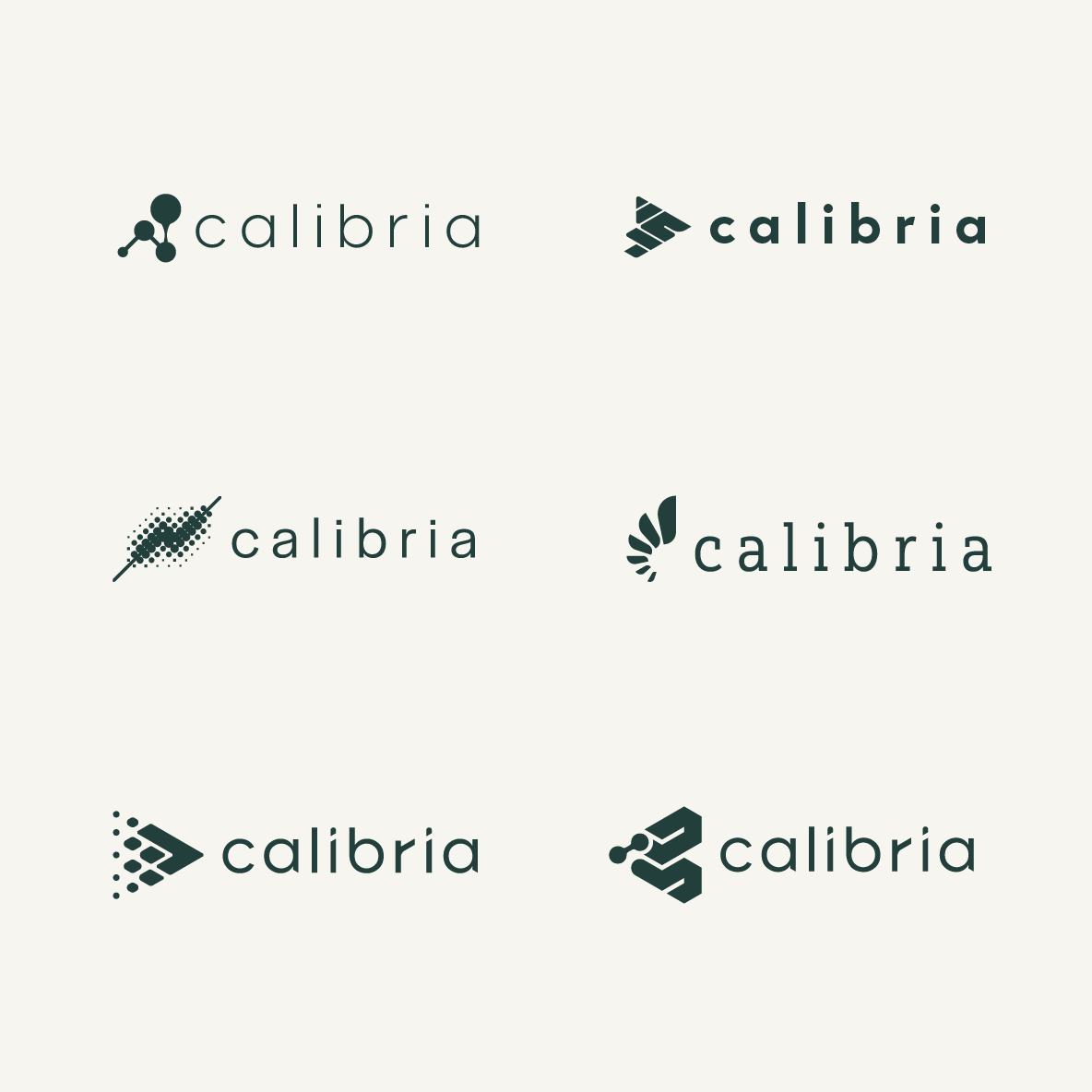
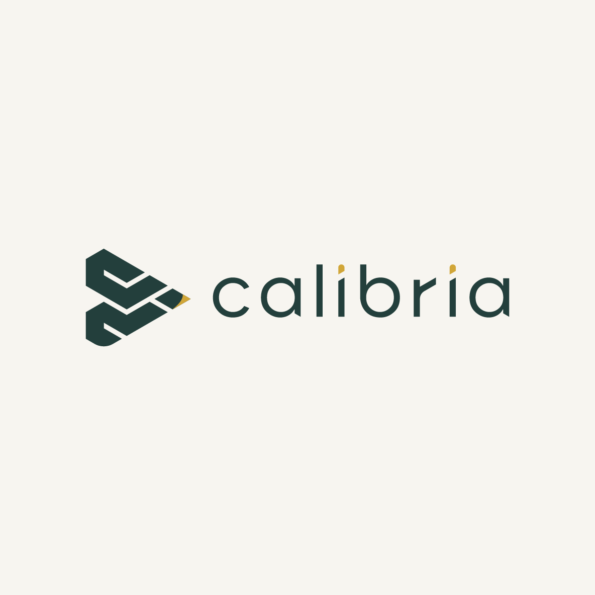
The logo balances structure, precision, confidence, and warmth. Its mark suggests calibration, direction, and forward movement.
04
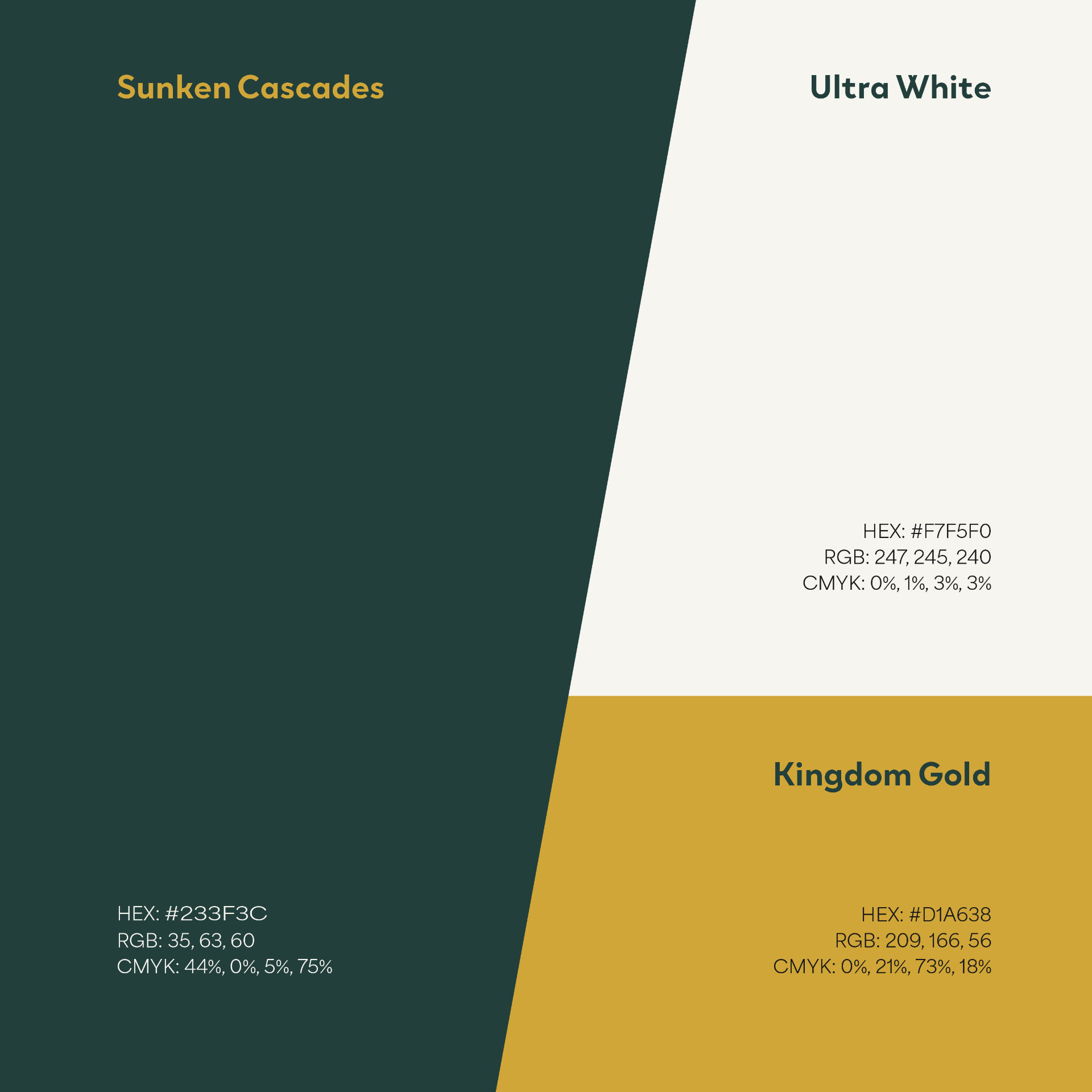
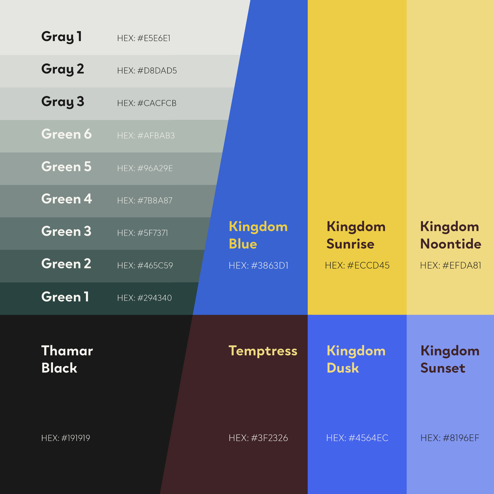
Sunken Cascades anchors the system in professional confidence. Kingdom Gold and Ultra White add focus and warmth.
05
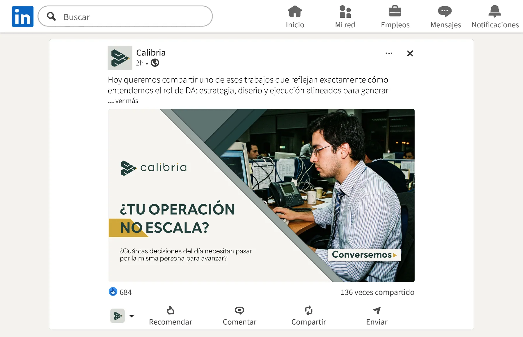
Photography feels close, unposed, and caught in real work: process maps, whiteboards, cluttered screens, and operating decisions.



Digital expression
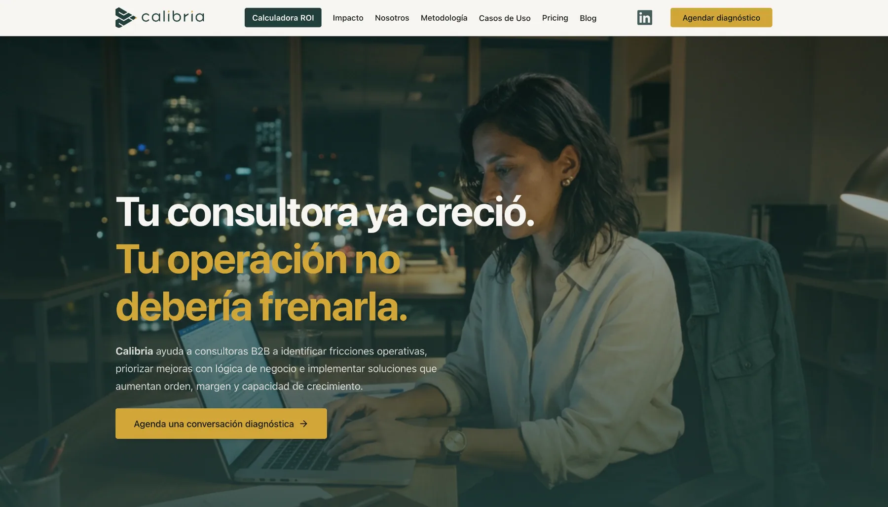
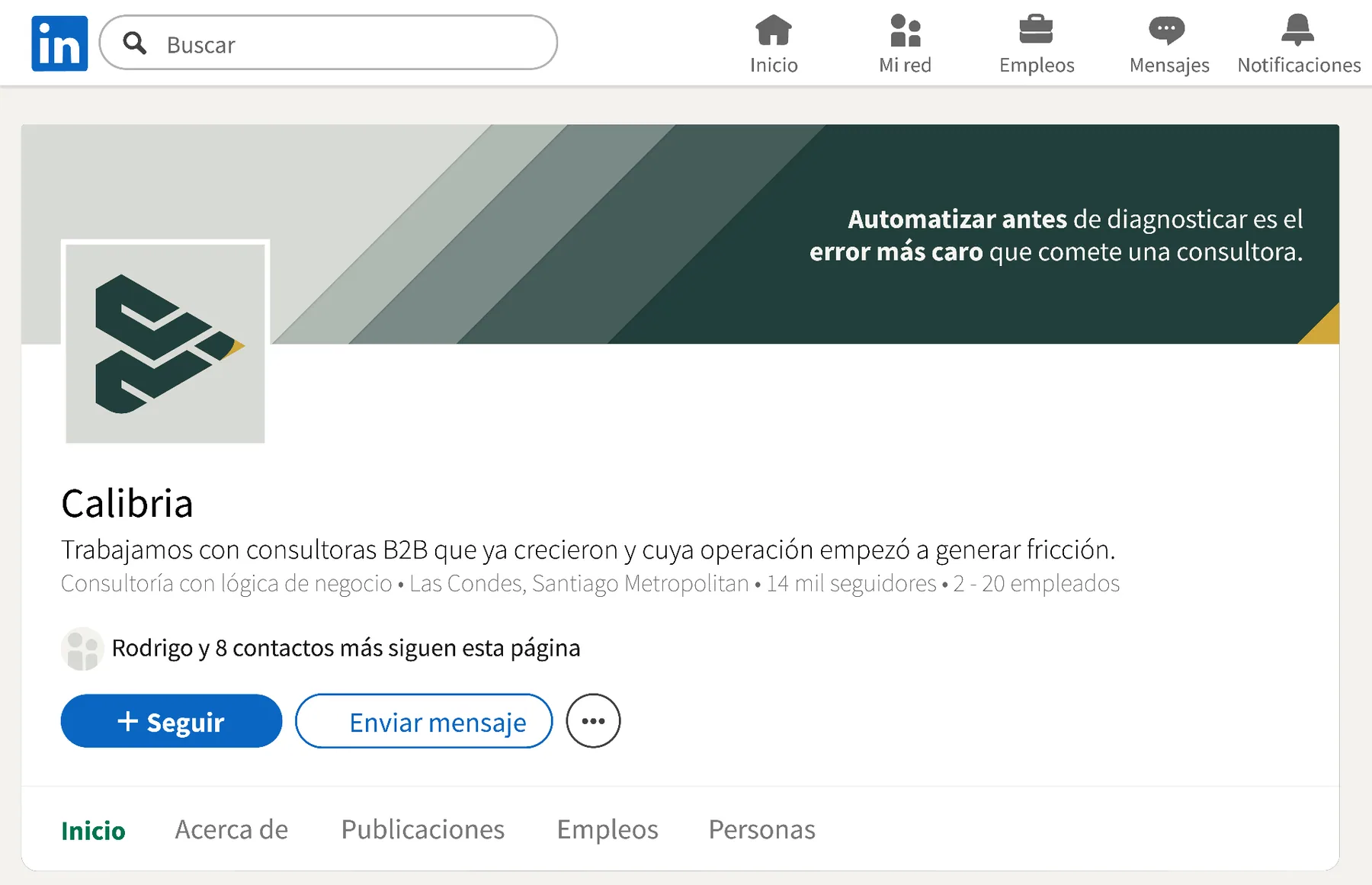
Structure, hierarchy, and color serve the same direction: speak clearly to consultancy owners who make fast decisions.
Brand in the wild
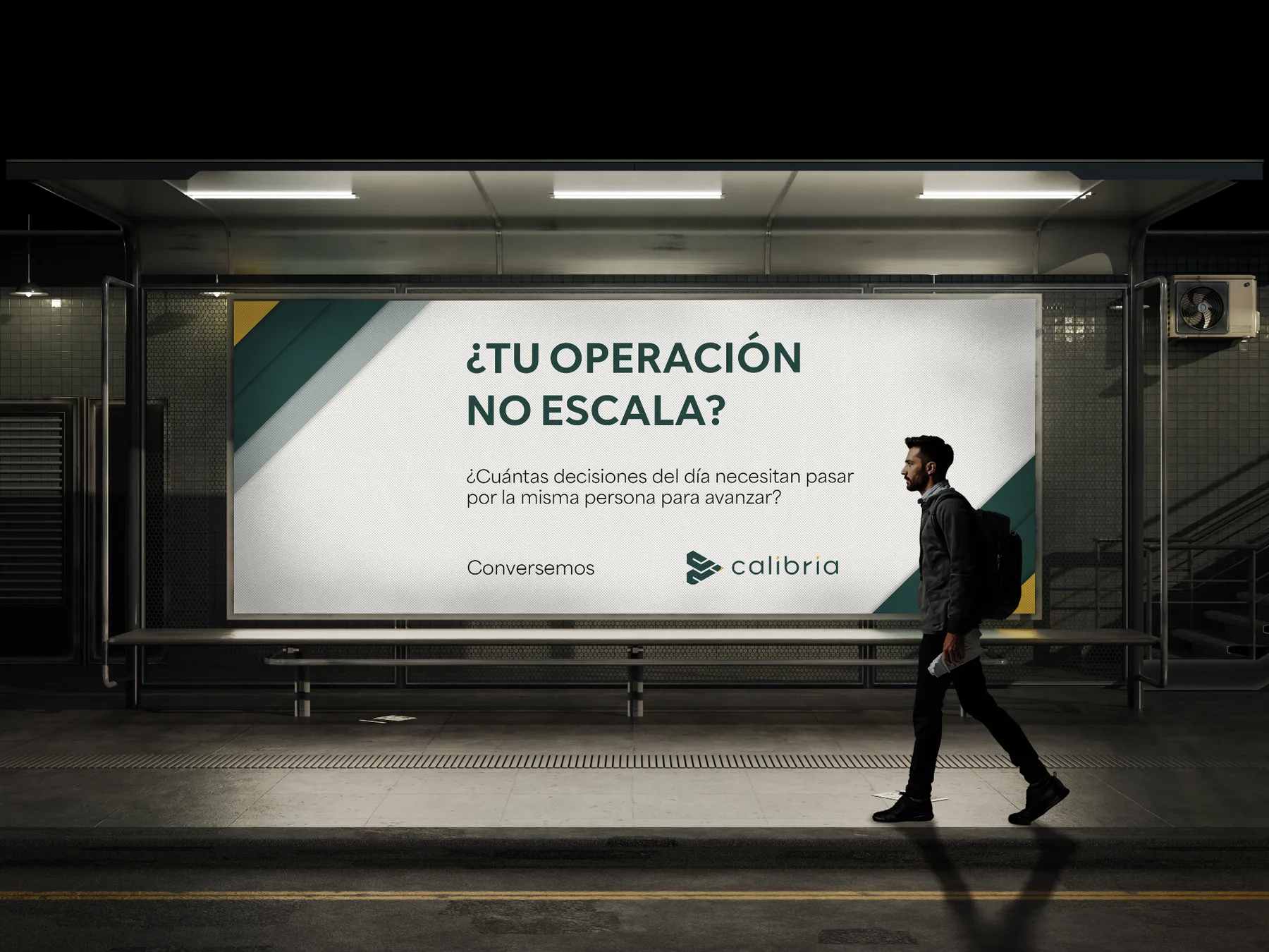
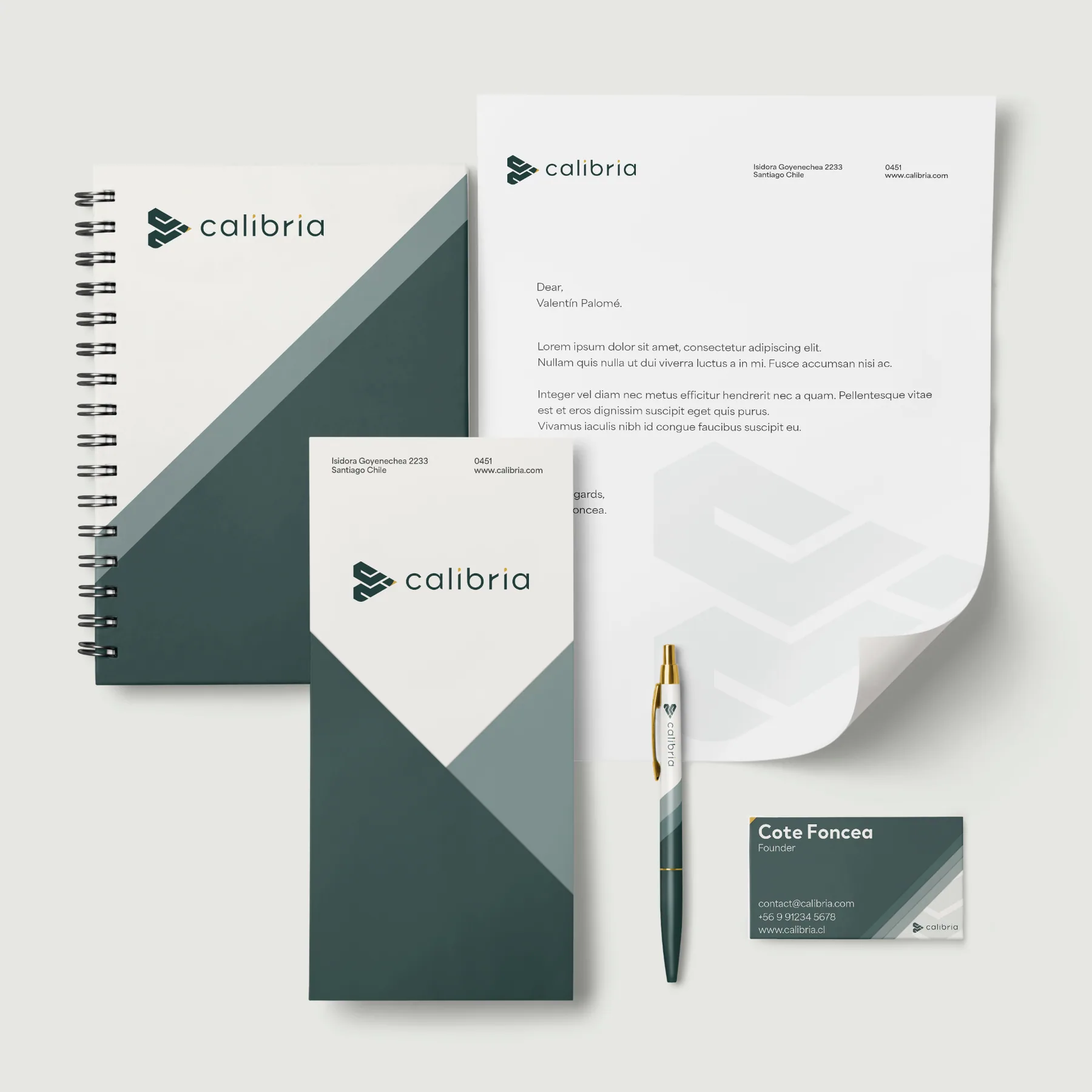
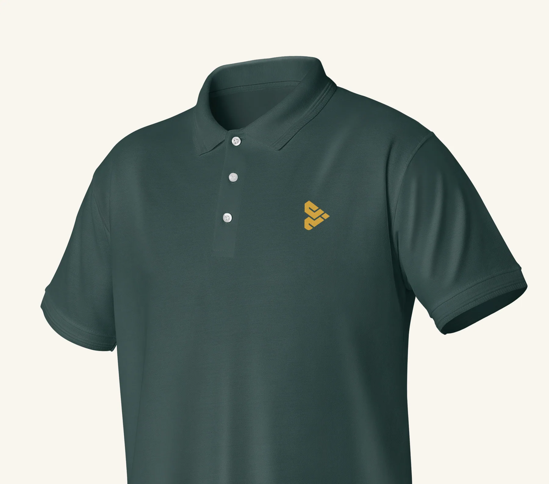
The system was designed to work beyond the manual, from public campaigns to everyday operating materials.


Results and testimonial
A coherent Brand system that makes Calibria easier to understand and remember, and gives the team a practical foundation for digital, physical, and everyday operating materials.
“Hark&Verve helped us see that, in a market flooded with the same promises, our real edge wasn't the technology. It was knowing exactly who we were built for.”Cote Foncea · Founder, Calibria
Your next stage